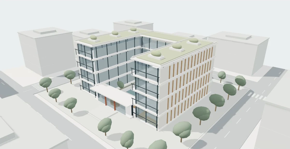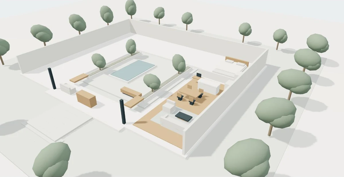
A tour can look excellent on a powerful workstation and still be difficult to use on a phone. Download speed, graphics memory, screen size and touch navigation all matter. A practical mobile brief defines the experience that must remain useful, then treats extra visual detail as something to justify and test.
Define the task and the target device
Begin with a task rather than a frame-rate promise. For a conceptual development, a visitor might need to open the overview, choose a building, inspect the entrance and request a quotation. Those actions should remain understandable on a small screen even if a detailed interior is optional. Name the oldest or least powerful devices that matter to the audience instead of testing only a recent flagship phone.
Consider the setting as well. A prospective client may open a link on mobile data between meetings, with little patience for an unexplained blank canvas. Keep the service explanation, contact action and a static overview available while the viewer prepares. A useful page still communicates its purpose when someone chooses not to launch the interactive scene.
Separate the initial view from detailed exploration
The first screen rarely needs every interior object and texture in the project. Start with the smallest scene that answers the overview question. Load additional information when the visitor selects a building or enters a more detailed view. This is a planning principle rather than a universal file-size target: different projects and audiences justify different budgets.
Khronos describes glTF as a delivery format intended for efficient transmission and loading of 3D content. Choosing it can help the pipeline, but it does not automatically make a large model lightweight. Geometry, textures, materials and dependencies still need inspection. Ask what is downloaded initially, what is deferred and what visual explanation remains available if the detailed asset takes longer than expected.
Spend detail where the camera needs it
A handle that occupies two pixels in a block overview does not need the same treatment as a material joint shown in a close-up. Use the expected viewing distance to decide where modeled detail is useful. Repeated objects, hidden geometry and oversized textures deserve review. Keep a copy of the authoritative design source while preparing a separate presentation model.
Display resolution also has a cost. The Three.js responsive-design guide distinguishes canvas display size from rendering resolution and explains how camera proportions must follow the displayed area. A high-density screen can invite much more graphics work than its physical size suggests. A deliberate resolution limit or lower-detail option may provide a more comfortable experience than attempting maximum visual quality on every device.
Make rendering and failure states intentional
A static scene does not always need to redraw continuously. Three.js demonstrates rendering on demand when the camera, data or scene changes, which avoids unnecessary work for an idle viewer. Animation, damping and assets that load later still require careful updates. The right strategy depends on the experience rather than a blanket rule that all scenes must animate all the time.
MDN recommends budgeting graphics memory conservatively, managing resources and handling lost WebGL contexts. In practical terms, a visitor needs an understandable way forward if graphics are unavailable or fail. Preserve a static overview, text describing the scene and the inquiry link. Avoid endless loading indicators that leave people unsure whether a scene is still working or whether they should try another action.
Use an acceptance matrix with real tasks
The following matrix describes a hypothetical test plan, not measured results for a particular website. Choose actual devices, browsers and network conditions for the project and record what happened. Test from a fresh visit as well as a repeat visit. A successful repeat load can hide a slow or broken first-time experience.
For each device, ask the tester to complete the same architectural task. Record whether controls overlap, orientation remains clear and ordinary page scrolling is possible. Also test a failed viewer load. A static alternative is only useful when its information and contact path are complete enough to let someone continue. Fix the most consequential failure before adding another decorative effect.
| Test condition | Task | Evidence to record |
|---|---|---|
| Mid-range phone on mobile data | Open overview and select the entrance | Time to useful content; loading feedback; touch accuracy |
| Tablet in portrait and landscape | Move between named views and reset | Control layout; orientation; canvas proportions |
| Desktop with keyboard | Explore viewpoints and open the brief | Focus visibility; action names; keyboard access |
| Graphics unavailable | Read the project overview and continue | Static alternative; scene description; contact access |
Deliver useful information before optional detail
- Readable page and overview
- Visitor chooses exploration
- Load the required scene
- Adjust detail to the device
- Complete the spatial task
- Continue to the brief
Measure the page and the viewer separately
Core Web Vitals provides useful webpage measures. Current good targets are a Largest Contentful Paint within 2.5 seconds, Interaction to Next Paint of 200 milliseconds or less and Cumulative Layout Shift of 0.1 or less, evaluated at the 75th percentile. These describe loading, responsiveness and stability across real visits; a single local test cannot establish field performance.
A 3D experience also needs task-specific observation. Can people select the correct building? Does the camera stop where expected? Do they understand the fallback? Keep test notes with the release version and repeat relevant checks after adding heavier assets or changing navigation. Performance is a continuing design decision: preserve a clear architectural explanation before spending more device resources on detail.
Ideas to take from this guide
- Name the audience’s essential mobile task and target devices.
- Keep a readable explanation and static overview available.
- Separate initial assets from optional detailed scenes.
- Review geometry, textures and rendering resolution.
- Test keyboard, touch, rotation and graphics failure.
- Record measured results instead of promising universal speed.
A mobile-ready tour delivers a useful architectural explanation under realistic conditions. Treat loading, detail, controls and fallback as parts of the same experience.
Sources & further reading
- Khronos Group — glTF Runtime 3D Asset Delivery ↗
- Three.js — Responsive Design ↗
- Three.js — Rendering on Demand ↗
- Google web.dev — Web Vitals ↗
- MDN — WebGL best practices ↗
Original editorial guidance with hypothetical examples. Product documentation and the project’s approved source files define actual capabilities and scope.