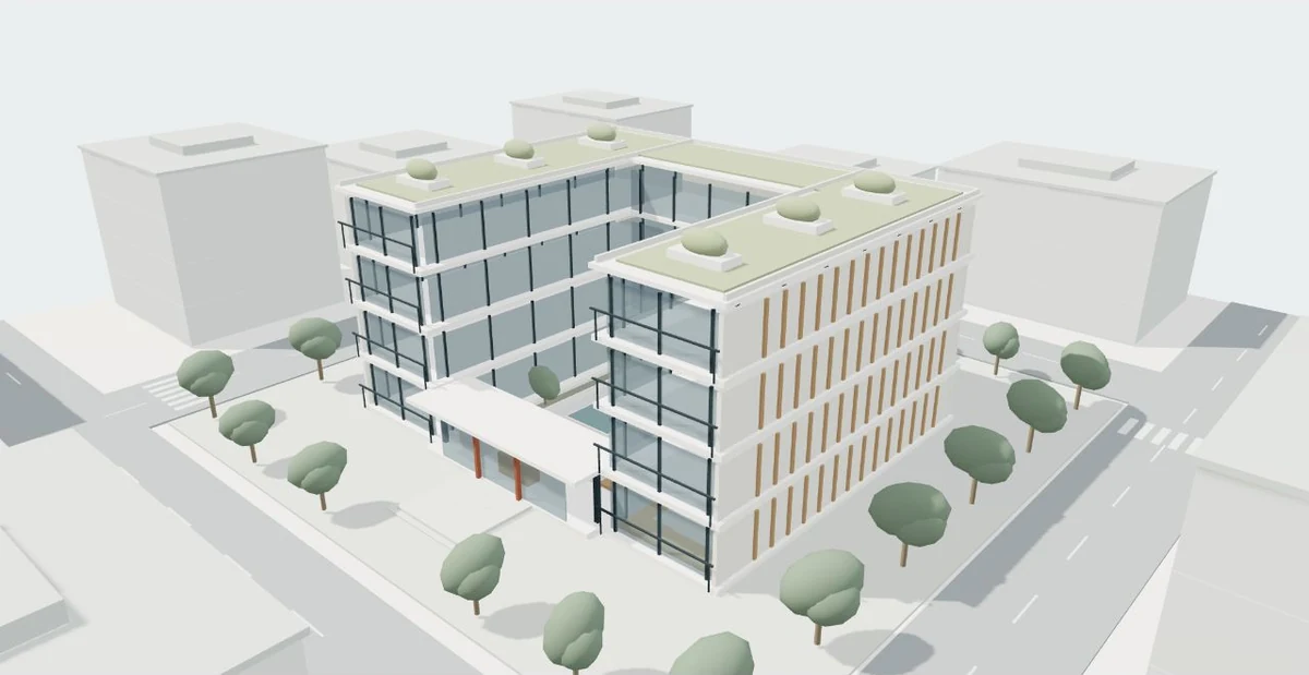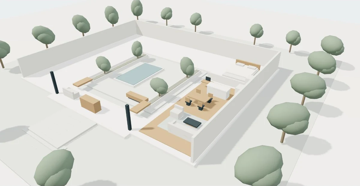
A virtual tour should welcome someone who explores with a mouse, touch, keyboard or assistive technology. Accessibility begins with the task: understanding a place and choosing a useful next action. The interface can offer several ways to achieve that task without making complex gestures or continuous motion the price of entry.
List the essential tasks before designing controls
Decide what information a visitor must be able to obtain. For a conceptual building, that might include recognizing the main entrance, understanding the courtyard connection and identifying which spaces are represented. Separate those tasks from optional visual effects. Orbiting the model continuously is one way to inspect it, but it is not necessarily the only way to communicate those relationships.
Write an equivalent route using named destinations and a readable description. A visitor who chooses “Entrance” and then “Courtyard” should understand the same important connection as someone moving a camera manually. This does not require every decorative object to receive a separate control. It requires the meaningful architectural information and inquiry path to remain available through an understandable sequence.
Provide useful keyboard operation and clear names
W3C’s keyboard guidance asks for keyboard equivalents to pointer functionality without demanding precise timings. Use ordinary buttons and links where possible, with names such as “Building overview,” “Zoom in” and “Reset view.” A visible focus indicator shows where an action will occur. Avoid controls that respond only when a key is held for a particular duration.
Keep the focus order consistent with the visual order. Entering the viewer should not trap someone inside it or prevent reaching the rest of the page. If a selected viewpoint changes, show its name in readable interface text. Screen-reader users need meaningful control names and useful state information, rather than a row of unlabeled icons. Test the entire journey through to the project brief, not just the first camera button.
Offer a pointer alternative to dragging
Keyboard support and alternatives to dragging solve related but different problems. W3C explains that someone using a touchscreen or adapted pointer may be unable to drag precisely while still being able to tap. A canvas controlled only by drag gestures can therefore remain difficult even when a keyboard route exists.
Provide discrete viewpoint buttons or other simple tap actions that accomplish the important navigation. Zoom controls and a reset button can reduce the need for repeated gestures. Make the controls large enough to operate comfortably and separate adjacent actions clearly. Check the behavior on an actual touch device: the page should still scroll naturally when the visitor is reading, and exploration should begin through an intentional action.
Let people control movement and orientation
Camera motion can disorient people, particularly when it begins unexpectedly or continues while they try to read. W3C’s animation guidance recommends respecting motion preferences and providing ways to disable nonessential movement. Named destination changes can be immediate when reduced motion is requested. A visible reset action gives everyone a reliable place to recover orientation.
Continuous animation is not a requirement for interactive 3D. Three.js demonstrates rendering on demand when the scene or camera changes. That technical approach can support a quiet viewer that waits for input rather than demanding attention. If a transition is useful, keep it purposeful and make its final location clear. Do not start an endless orbit simply because the page has reached the viewport.
Pair the scene with an equivalent explanation
Non-text content needs an appropriate text alternative. For a complex architectural scene, a short label alone may not communicate the useful spatial relationships. Add a concise overview, named spaces and a description of how they connect. A simple 2D diagram can help other readers, but it also needs its own accessible explanation.
The following table illustrates a hypothetical lobby presentation. Descriptions should follow the approved design information. If the drawing has not established a step-free route, do not infer one from an attractive model or call the building accessible. The accessibility of the website controls and the accessibility of the physical proposal are different review questions.
| Viewer feature | Equivalent information | Review question |
|---|---|---|
| Building overview | The lobby connects the street entrance with a central courtyard | Can this relationship be understood without moving the camera? |
| Entrance viewpoint | Named entrance location and adjacent spaces | Does the label match the current drawing? |
| Courtyard viewpoint | Description of the lobby-to-courtyard connection | Can the visitor return to the overview? |
| Material selection | Written names and selected state | Is the choice understandable without color alone? |
Several interaction paths can reach the same information
- Choose the viewing task
- Use named viewpoints
- Offer keyboard and tap controls
- Describe spatial connections
- Keep motion optional
- Reach the project brief
Test a real journey with several methods
Begin with a keyboard-only pass: open the page, reach the viewer controls, select views, reset and continue to the inquiry. Watch focus visibility and check that no action requires a mouse. Then use touch without dragging to complete the same essential tasks. Increase text size and check whether labels wrap or overlap the scene.
Next, enable a reduced-motion preference and inspect the selected-view feedback. Review the text explanation with the canvas unavailable. Ask a tester unfamiliar with the project to describe the spatial connection. A checklist helps identify problems, but a broad accessibility claim needs a broader evaluation of the complete experience. Record what was tested, fix the barriers found and keep those checks in future release reviews.
Ideas to take from this guide
- Define the architectural information every visitor needs.
- Use named buttons, visible focus and a logical focus order.
- Provide tap alternatives to meaningful drag actions.
- Keep orientation recoverable through a reset control.
- Respect reduced-motion preferences and avoid unexpected animation.
- Test equivalent text, keyboard, touch and the complete inquiry route.
Accessible navigation gives people several clear ways to understand the same place. Design the information, the controls and the text explanation together.
Sources & further reading
- W3C WAI — Understanding Keyboard ↗
- W3C WAI — Understanding Non-text Content ↗
- W3C WAI — Understanding Animation from Interactions ↗
- W3C WAI — Understanding Dragging Movements ↗
- Three.js — Rendering on Demand ↗
Original editorial guidance with hypothetical examples. Product documentation and the project’s approved source files define actual capabilities and scope.